“Colours, like features, follow the changes of the emotions,” Picasso once remarked, capturing the profound impact colours have on our lives and environments. In the realm of bedroom design, colours are not merely decorative; they are a language that speaks to our deepest senses, influencing our mood, energy, and even our dreams. In this journey, we will delve into the world of vibrant hues and soothing tones, discovering how the right colour choices in furniture can shape our sanctuary of sleep and relaxation.
-
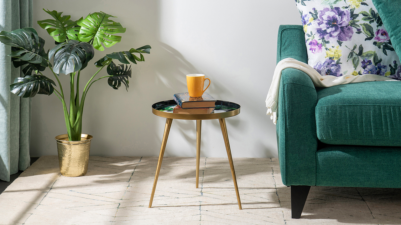
Colour Psychology in Bedroom Design:
- One intriguing aspect often overlooked is the concept of ‘colour temperature’. This idea categorises colours into warm and cool tones, impacting our perception of space and comfort. Warm colours, like reds, oranges, and yellows, evoke feelings of cosiness and warmth, making extensive, sparse bedrooms feel more inviting. On the other hand, cool colours, such as blues, greens, and purples, are celebrated for their calming and soothing effects, ideal for creating a tranquil sleeping environment.But here’s the twist: the same colour can have different shades with varying psychological impacts. For instance, a bright lemon yellow might be energising and less suited for a restful bedroom, while a soft, buttery yellow can offer a gentle, comforting ambience. This subtlety in shade selection means that you’re not just choosing a colour; you’re setting the emotional tone of your bedroom, influencing relaxation, sleep quality, and even your mood upon waking.
-
Historical Colour Trends in Bedroom Furniture:
- Art Deco Movement: The early 20th century marked the rise of the Art Deco movement, which brought a significant shift in the colours of bedroom furniture. This era was characterised by bold geometric patterns and a vibrant colour palette, diverging sharply from the muted, natural tones that dominated the Victorian era.
- Post-World War II – 1950s: This period witnessed a surge in economic prosperity, and a corresponding optimism mirrored in bedroom furniture colours. This period saw the popularity of bright, cheerful colours, with a particular fondness for pastels like pinks, blues, and greens.
- Era of Rebellion: The 1960s and 1970s introduced a rebellious and experimental design spirit, evident in the colours of bedroom furniture. This period was marked by psychedelic patterns and a bold, unconventional colour palette featuring prominent use of oranges, purples, and greens. These choices reflected the era’s ethos of experimentation, freedom, and breaking traditional norms.
- Late 20th Century – 1990s Minimalism: This period was dominated by neutral and earthy tones, with a prevalence of colours like beige, cream, and other muted shades. This trend towards minimalism and neutral colours reflected a broader cultural shift towards simplicity and understatement in design.
- Current Trends – Resurgence of Vintage: There has been a noticeable resurgence of vintage colours and Art Deco elements in bedroom furniture. This trend might be interpreted as a nostalgic yearning for the simplicity and uniqueness of past eras, coupled with a renewed appreciation for craftsmanship and artistic expression. The revival of these vintage elements indicates a cyclical nature of design trends and a continuous dialogue between the past and present in interior design aesthetics.
-
Sustainable and Eco-Friendly Colours in Furniture:
- Sustainable and eco-friendly colours in furniture design are revolutionising how we decorate our spaces, blending environmental consciousness with aesthetic appeal. These colours come from natural, non-toxic sources like clay, minerals, and plant extracts like berries, roots, and algae.
- These natural colourants offer a rich and diverse palette that’s surprisingly resilient and vibrant, offering a rich palette that diverges from conventional synthetic dyes. What’s fascinating is how these natural colours reduce the emission of harmful compounds and bring unique, earthy tones to furniture, creating a more organic and harmonious feel in our living spaces.
-
Cultural Influences on Bedroom Colours:
- In India, however, you’ll find a starkly different aesthetic, with bedrooms often adorned in rich, warm hues like reds and oranges, reflecting the country’s love for colour and vibrancy. These cultural differences in colour preferences aren’t just aesthetic choices; they are deeply rooted in history, climate, and social values, offering an intimate glimpse into how people worldwide create their sanctuaries.
- Bedroom furniture in Mediterranean countries often features vibrant blues and whites inspired by the sea and sun, evoking a sense of relaxation and holiday serenity. In contrast, Scandinavian design favours minimalism, with muted greys, whites, and pale woods, reflecting the region’s love for simplicity, functionality, and connection to nature. Meanwhile, in parts of Asia, particularly Japan, the use of calm, neutral colours in bedroom furniture, combined with natural materials like bamboo, mirrors a philosophical emphasis on tranquillity and harmony.
-
DIY Colour Customisation Ideas in Furniture:
- Chalk Paint Makeover: Chalk paint is a fantastic option for those looking to give their old furniture a new lease on life. This type of paint is known for its ability to adhere to various surfaces without priming or sanding. It provides a vintage, matte finish that completely transforms tables, chairs, or even larger pieces like wardrobes.
- Ombre or Tie-Dye Effect on Upholstery: Adding a burst of colour to upholstery with fabric dye can be fun and striking. Techniques like ombre or tie-dye are perfect for personalising upholstered furniture such as sofas or chairs. This method allows for a playful and creative expression, resulting in a unique piece that can become the focal point of any room.
- Stencil Art with Spray Paint: Using stencils in combination with spray paint can create intricate patterns or bold designs on furniture. This approach is excellent for those who want to add an artistic touch to their pieces. It works well on flat surfaces like tabletops, dresser fronts, or cabinet sides, allowing for customisation that ranges from elegant to edgy.
- Colourful Hardware Replacement: Sometimes, a small change can make a big difference. Replacing the hardware on furniture, such as knobs, handles, and pulls, with colourful alternatives is a way to add a pop of colour. This simple and cost-effective DIY trick can update the look of dressers, cabinets, or drawers.
-
Feng Shui and Colour Harmony:
- Feng Shui, the ancient Chinese art of placement, offers intriguing insights into the use of colour harmony in furniture, emphasising aesthetic appeal and the flow of energy (Chi) in a space. According to Feng Shui principles, colours are connected to the five elements (wood, fire, earth, metal, and water), and their thoughtful application can bring balance and positive energy into a room.
- For instance, green hues, representing wood, are believed to promote growth and vitality, making them ideal for study areas or home offices. Reds and oranges, symbolising fire, can stimulate passion and excitement and are often used in living spaces to encourage lively conversations.
- However, it’s about balance; too much fire can lead to restlessness. Cooler blues and blacks, representing water, are considered calming and introspective, suitable for bedrooms where relaxation is key. Earth tones like beige or light yellow can stabilise and ground space, often used in living rooms or places where the family gathers. The beauty of Feng Shui in colour harmony lies in its holistic approach, where the choice of colours in furniture and decor is not just about trends or personal preferences but about creating a harmonious environment that nurtures well-being and positive energy.
- It’s clear that the colours we surround ourselves with in our most intimate spaces do more than just please the eye. They touch the soul, influence our mood, and shape our experiences. Whether the calming blues that invite tranquillity, the energising reds that spark creativity, or the earthy greens that connect us to nature, each hue is pivotal in crafting our haven. After all, in the words of Marc Chagall, “Colour is everything, colour is vibration like music; everything is vibration.”